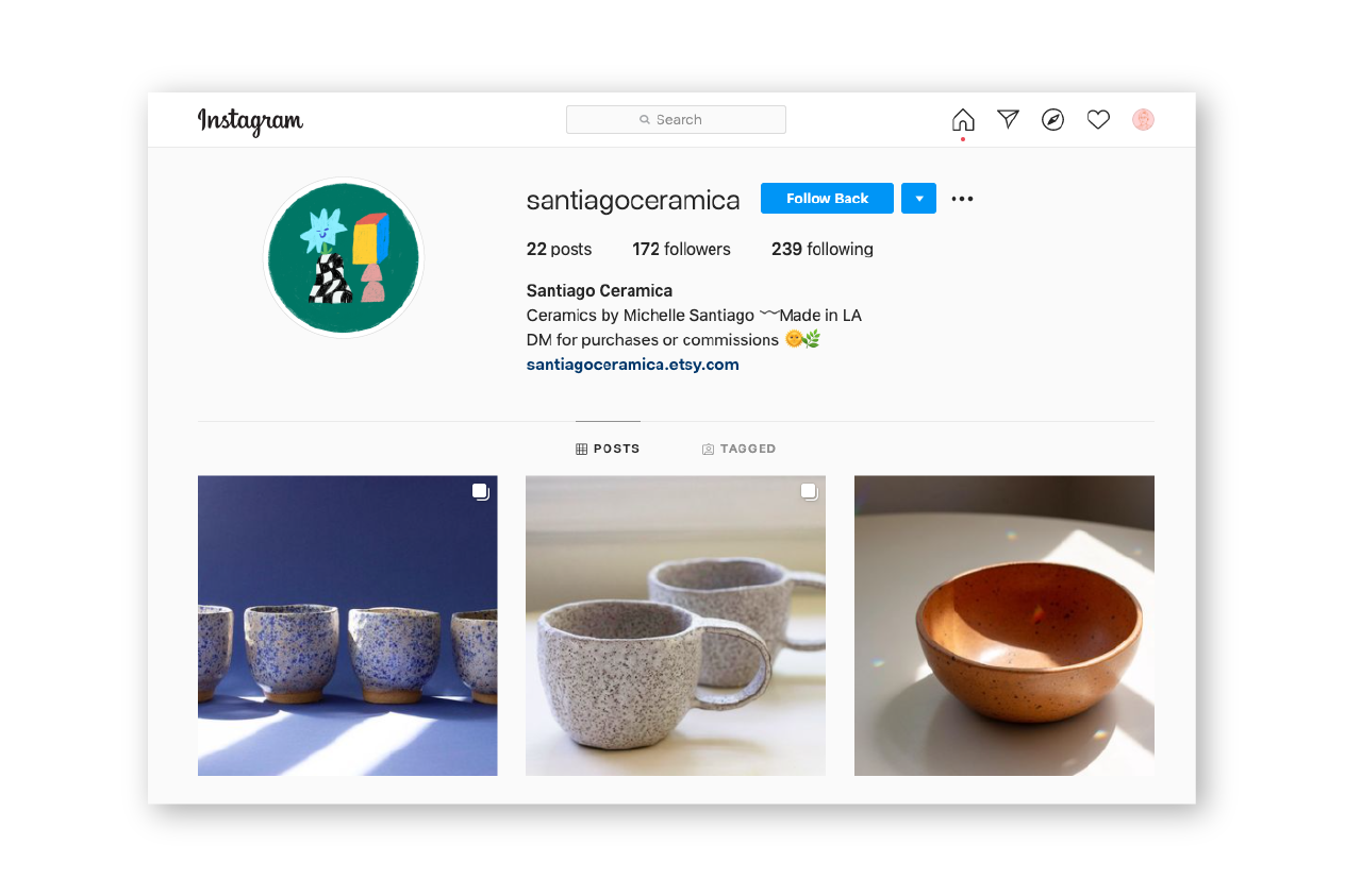
Earlier this year I was asked by a friend to design a logo and accompanying branding materials for her ceramics company Santiago Ceramica.
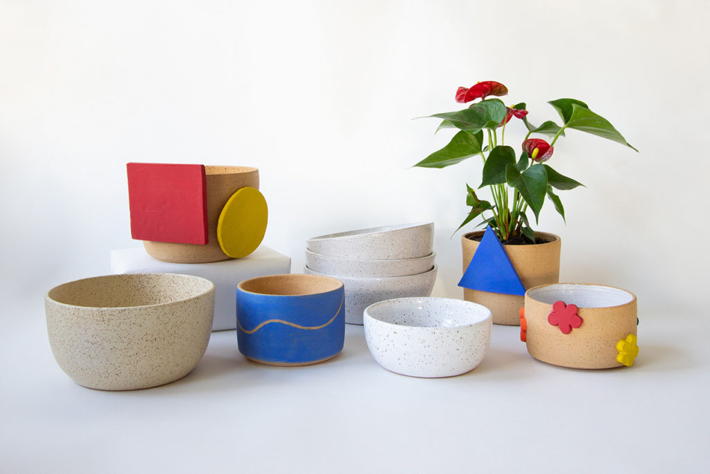
This was her first time creating a brand for herself while using her own name. It was important that the branding could reflect her use of primary colors, playful concepts, and her love for modern art.
It was fun and challenging to work with a friend as they were discovering what their new brand could bring to the world, while also aiming to stand out from the crowd. Ultimately we were both very excited to find a design we both immediately connected with, which we know has lots of potential to connect with others.
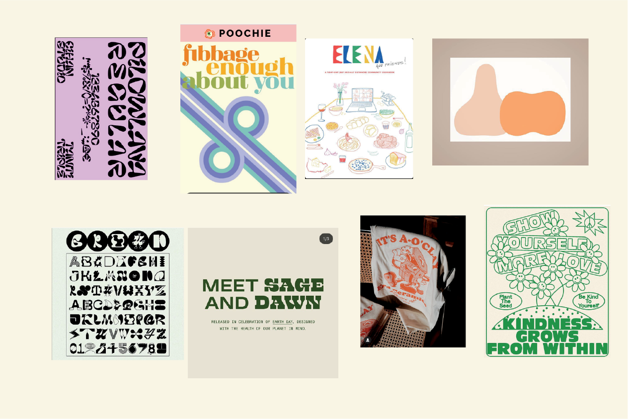
This was our starting point, Michelle would tag me on Instagram whenever she saw something she was drawn to. I was starting to pick up a pattern of playful branding, bright colors, nods to contemporary art, and illustrations
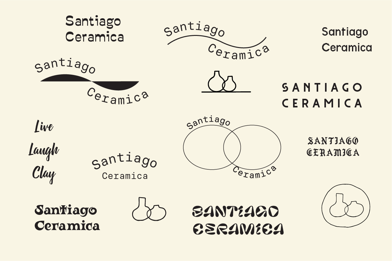
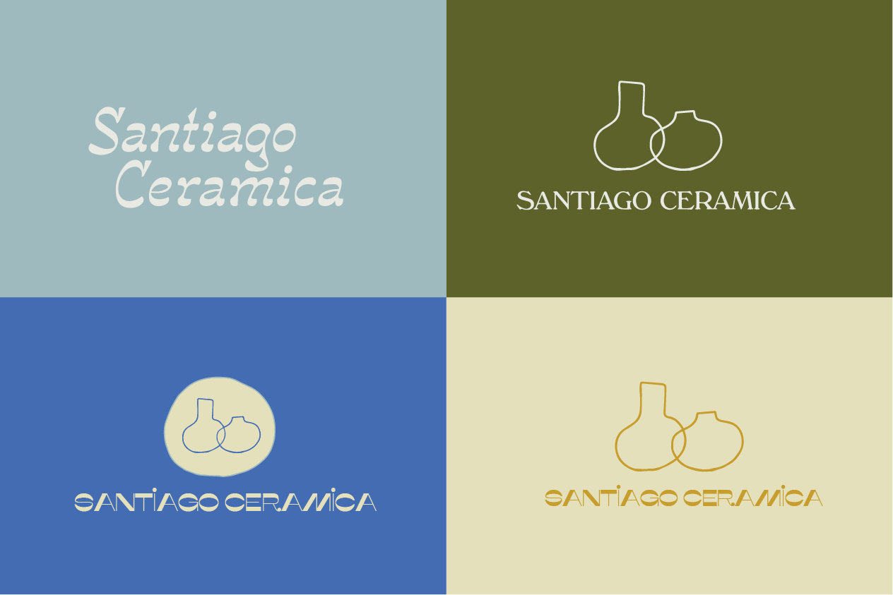
From there I quickly sketched some ideas in Illustrator, Michelle had shared a drawing she did on a napkin of two vessels overlapping, I used a Tablet to recreate her drawing and wanted to try typefaces I thought she might be drawn to. I wanted to play with curves and blobs mostly.
From that point we found some typefaces we liked, and tried different layouts & lockups. It was definitely too early to commit to colors, but wanted to get that conversation started. Sometimes I think use of colors can hint toward a mood, and can help navigate the way to our target. Although we loved some of the type, we weren't impressed with the vessels. We also didn't care to be so literal, and this branding looked very typical based on other ceramic studio logos.
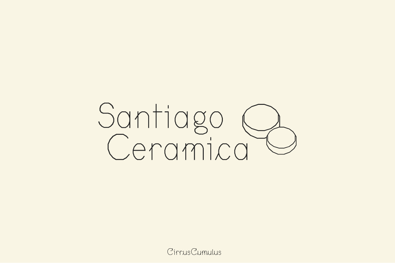
For the next set I decided to use more abstract and interesting perspective of bowls. We loved the playful shapes of this type, almost like something you'd see in an elementary school cursive workbook, but felt too sharp as well.
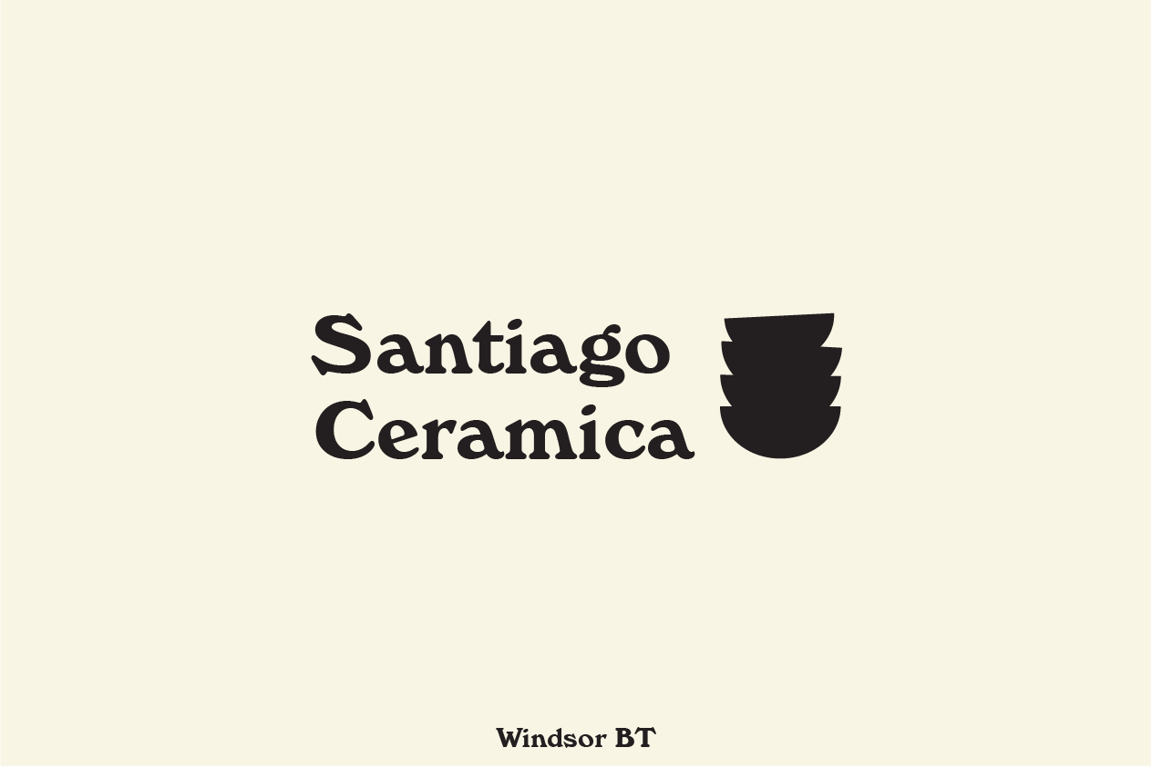
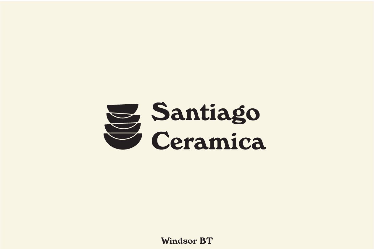
This time I wanted to stack the bowls and create a bit of curiosity, the tilted bowl at the top somewhat hints at the stacking nature of ceramics, and helps the viewer see it as such. I rounded edges to give a more analog look, maybe something created by hand.
Another attempt but lighter, not as heavy, and introducing the overlapping lines similar to the vessels from the previous set.
Same overlap style, filled in provide a weight.
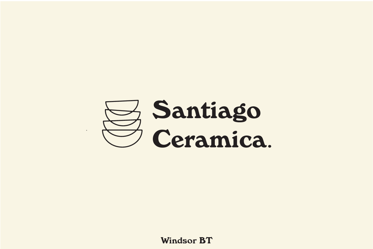
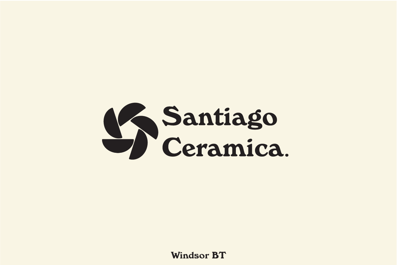
I wanted to continue creating seemingly abstract designs, while still utilizing a familiar bowl silhouette. This was an interesting take but felt very industrious, I'm very attracted to softer retro fonts like Windsor, it can look very modest but decided it wasn't a good fit and wanted something with more character.
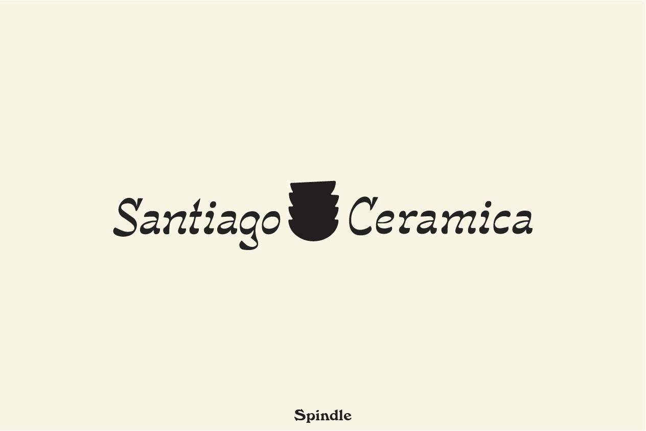
This was the last take from this set, we both really liked this font, it felt hand drawn, it seemed to invoke South American tones, which aligns with Michelle's cultural background. We both weren't completely sold on this set, and decided to start on paper again.
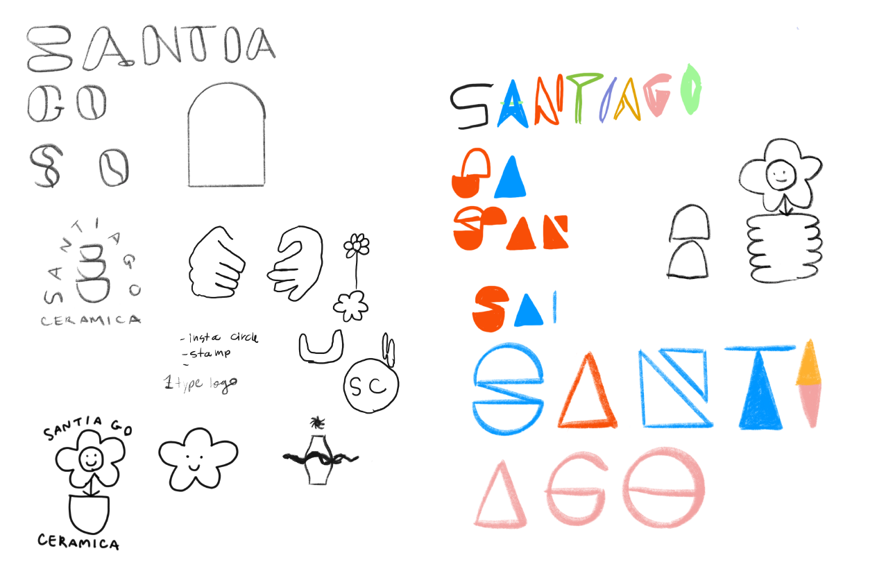
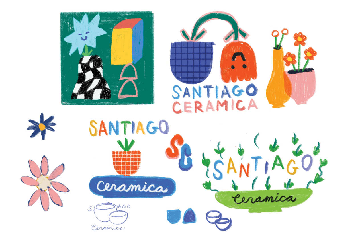
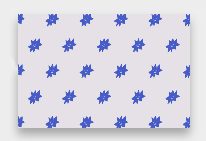
Michelle really wanted to try something hand drawn which I knew would be challenging but would certainly provide something unique. Here are some early drawing from a tablet, mostly looking to incorporate her ceramic shapes into the logo, and using brushes that looked like basic drawing tools like crayons and pencil. She liked the idea of using a flower in her logo with a smiley face.
This was actually a funny point where I was mostly doodling, I let go of the idea of being clever or getting something perfect and found myself drawing flowers and bowls that were actually being used as planters. I managed to keep in mind all of Michelle's goals and leaned into a modern art direction. We both loved this page a lot and decided the top left illustration was by far our favorite. The upside down flower was an honorable mention.
I worked on lockups from here, trying to find a way to incorporate her name around such an unusual design. I wanted to emphasize the two stacked pink bowls and filled them in. Michelle liked the mulit-colored name from the previous drawings, but was afraid it looked too "Googly"
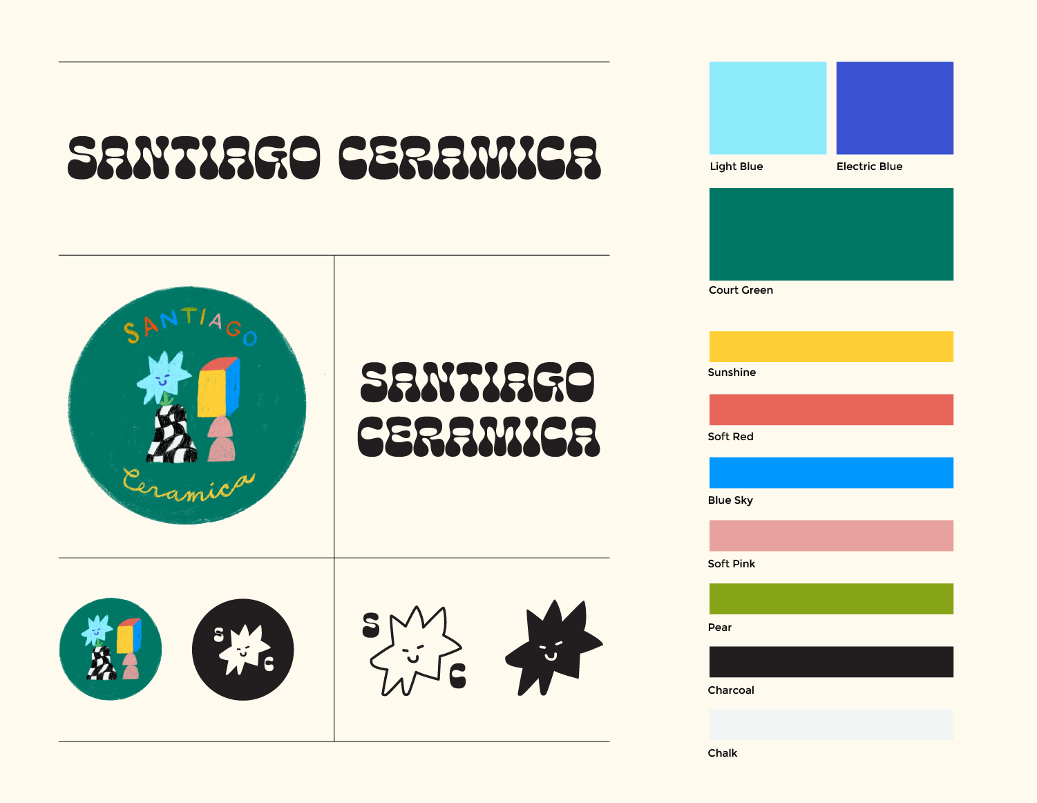
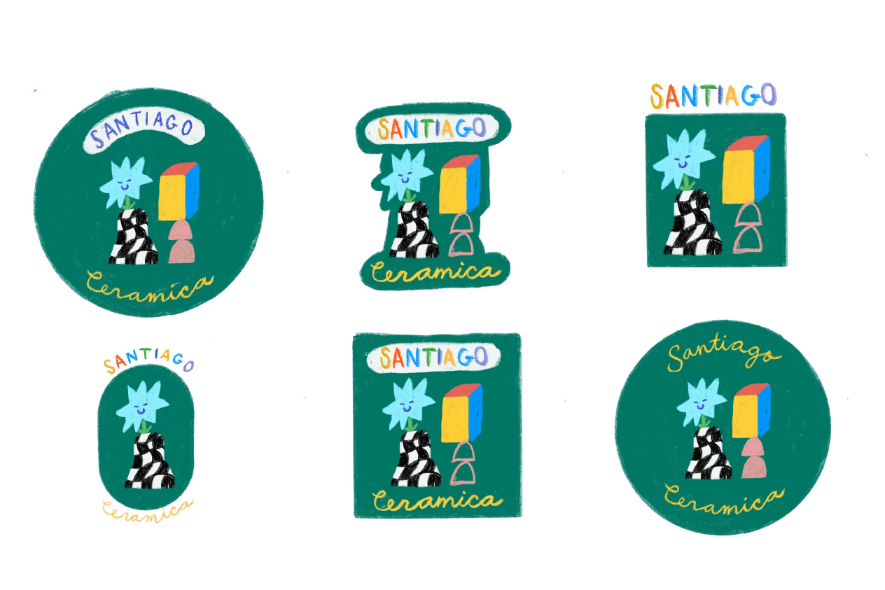
We altered the colors to stray a bit away from the primary colors Google uses, and incorporated cursive which Michelle was really fond of and continued this child-like vision. I created another version with no text for a slightly wider range of usage.
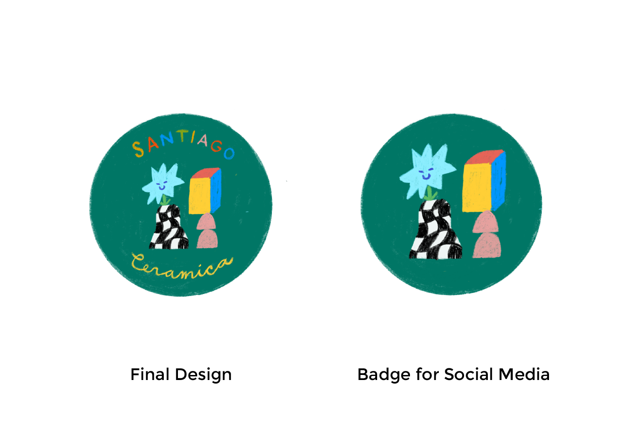
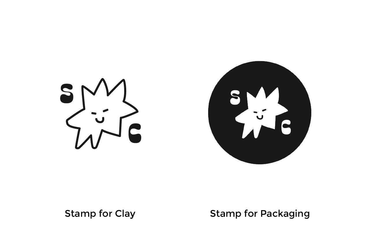
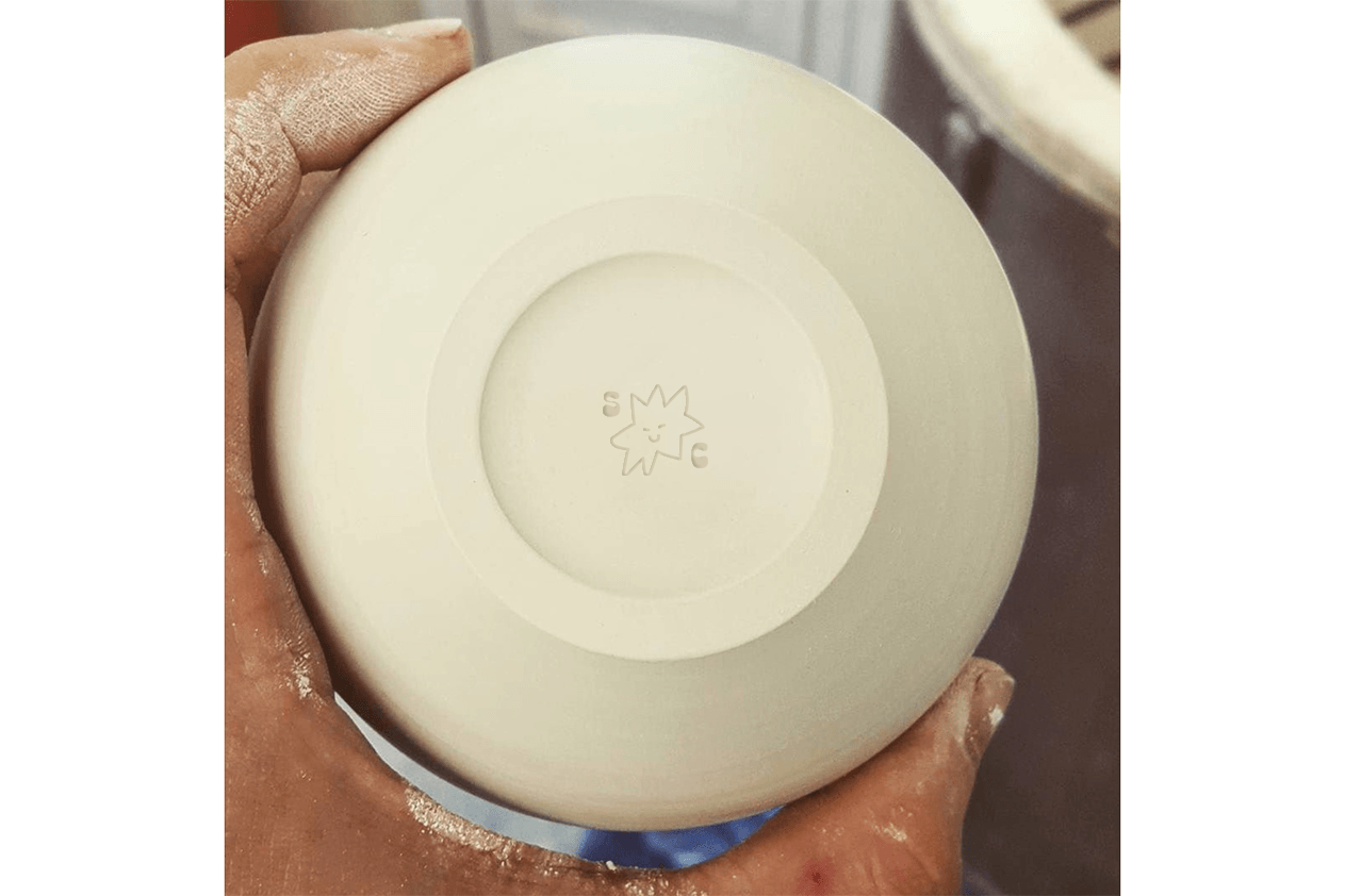
I definitely loved the final logo we came up with but felt that we needed a solid 1 color version with much more simple designs to work at all sizes. I outlined the flower shape and face and that seemed like a really good solution for future multi-media branding.
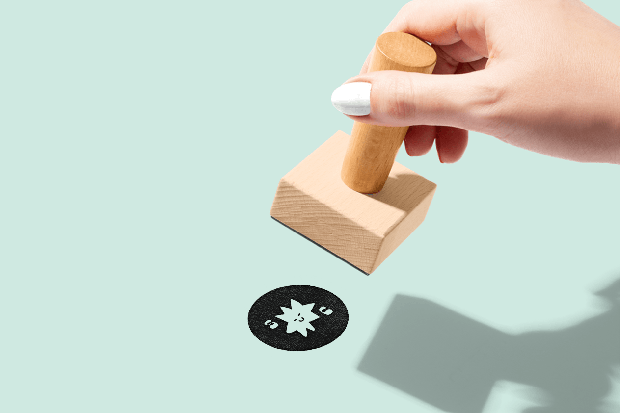
We landed on two versions of this logo, we needed one for a underglaze stamp for her pieces, and one for an ink stamp she planned to use for packaging and paper bags.
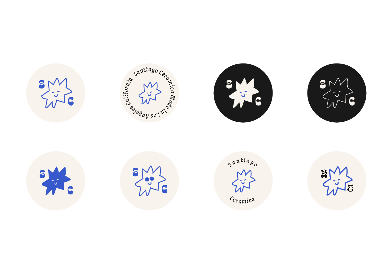
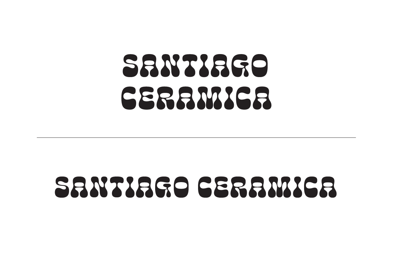
We also decided it would be a good idea to have a solid type for her name when the hand drawn version couldn't be used. Michelle found this font and really loved it. I really love these retro blob shaped fonts so we decided this would work.